Welcome to Gaia! :: View User's Journal | Gaia Journals


View User's Journal

Notes From Gaia
Random thoughts from inside Gaia
Development Update 2/11
(Yes, the development update for the week of 2/11 is being written on 2/13. Pay no attention to the man behind the mirror!)

Bugs We're Tracking
I mentioned it last week, but the rogue advertisement that (maybe) drops a virus onto machines is beginning to personally offend me. We went to the different ad networks and gave them the URL, and they all claim that it isn't theirs. So, I'll make a post in SF about it, and hope to get some evidence that leads to a smoking gun.

Gaia and The Unbearable Rightness of A/Bing
So, we'll be making a bunch of changes to the visual look and feel of some high traffic pages soon, where "soon" = in weeks, not months or years. Lanzer is supposed to make a journal post about it, but I'm going to give both readers of this journal a sneak peek.

But first, a note on how we're going about this:

The site is currently a mix of a bunch of different styles, ranging from old-school "Going Postal" to the revised design of the landing pages. However, we've been talking to Gaia users from all over, and the general consensus seems to be that the current look we have maybe isn't as effective as it could be.

But how do you test something like that? Basically, we'll be running a set of alpha/beta tests (also called A/B tests). This is where we randomly show different pages to different users, and then we take a look at the results: does this set of pages cause people to click around more? Does it seem more interesting to them? Does it show the functionality that makes people want to play with the site more?

So, a sneak peek at the new guest homepage (the one you get when you're not logged in) that some people will see:

User Image

And, the voice of a million Gaians screamed out: oh my god, it's so white.

I like the new look, though. It looks less like a collection of modules and more like something that all ties into one central theme. The juxtaposition of IRL photos and avatars is different, and it's going to be interesting to see how people take it.

Note that a major site redesign isn't in the cards -- not yet, anyway. Part of the reason to A/B test is to see how people react to the new pages.
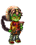
Registration
Along with this change are some changes to registration that, deities willing, will hit this week. We've substantially revamped it to make it a) less forbidding and b) harder to bot. Instead of the painful, linear right-and-left arrows, we offer a palette of design choices (and, I'm sorry for the fuzzy quality of these screen shots):
User Image

If you are fashion-challenged and couldn't make a coordinated outfit to save your life, we offer a set of prearranged outfits.
User Image

Three easy steps to create your avatar.
User Image

Valentine's Day
The events team (Fleep & Company) really did a great job on the Valentine's Day event. It's less of a database load than Halloween, given that the event is less complex, but it still seems really fun. Give a dev a kiss!


User Comments: [60] Viewing page 0 of 2 · Goto Page: 1 2 »  [add]
Dragon Ladysupreme
Community Member
avatar
commentCommented on: Wed Feb 13, 2008 @ 03:25pm
Well, you're right. The guest landing page is extremely white. Couldn't you switch it to one of the lightest of greys to make the model pop out a little more? Even if it's subtle, like #F7F3F3, as it looks so close to white but just a tad darker. White tends to be blinding, and gives some people with eye issues headaches.

Well there's my criticism. I felt like I needed to do just a little. I like that you're changing the way the avatar creation is being done, and adding more styles to start off with to boot. Random looks and new beginner sets, even. I like all that.

Honestly, the way everything seemed to be broken apart on a single page was off-putting. I don't know, it was just weird and unorganized? I think that's close enough to what I'd say.


commentCommented on: Wed Feb 13, 2008 @ 03:28pm
The new registration looks really, really great. I'm eyeing the clothes that avatar has on... I think I want them. o.O

That guest home page, though, is definitely really, really white. I'm not going to say I don't like it yet, though, because I want to see it IN ACTION. Maybe it's just a matter of getting used to it. o.O I'm excited to see the changes, though.

*smooches*


gl0w in the dark
Community Member
Dreda
Community Member
avatar
commentCommented on: Wed Feb 13, 2008 @ 03:44pm
Wow the new registration page is really awesome.
It even has an outfit option, now we just need that for regular equip page

Can't wait for that to appear.

Yet I can't say much about the new guest page, because I haven't seen the current one. sweatdrop


commentCommented on: Wed Feb 13, 2008 @ 03:48pm
I like the spare design of the alpha test page and the new avatar creation looks much, much better. I agree that the big white space could use some fixing. blaugh

Thanks for the preview!


Indoras
Community Member
Darien S.
Community Member
avatar
commentCommented on: Wed Feb 13, 2008 @ 04:04pm
Can't wait to see some of the new things coming ^___^


commentCommented on: Wed Feb 13, 2008 @ 04:05pm
Are those new starter outfits? They look so much better. Now I'm going to have to make another mule.


Elijah Frost
Community Member
dBEf-GAEc-18E-BBAf
Community Member
avatar
commentCommented on: Wed Feb 13, 2008 @ 04:10pm
It's so white! rofl

Man, am I *NERVOUS* about where Gaia's going these days. I see so many great opportunities ahead (mostly in terms of how content is shared). While some of them are obvious *BLING BLING*, some are in that gray zone that makes me wiggle and jiggle in my clothes at night, wondering if the wrath of over nine thousand users will soon lay upon each and every single employee at Gaia Online.

And about the Alpha/Beta testing - Is the outcome of this test expected to be that areas of the site people *want* to access but don't know how or can't are going to be viewed more now? - I can't imagine you "stealing" much traffic from other areas of the site unless there's a reason for this to happen. Oh btw, I like the current landing page, severely. Change it to a lesser form and I shall make that number 9001.

Quote:
It even has an outfit option
We'll get outfits eventually. They're working on it.

Quote:
i'm not fond of the using real people. i don't particularly like images of real people
Nor am I, LokiLB. I think we can all recall when something we thought was cool went ahead and began using really lame advertisements or people, and looked retarded. rofl

Gaia's done that, but only partially with it's Myspace advertisements! Damn getting invested. Damn it all! It may have helped us tremendously, but it also means we have standard to keep up to in order to retain investment security D:

Quote:
It's white and very clear.
I might agree with you after I'm done applying ice water on my eyes.


commentCommented on: Wed Feb 13, 2008 @ 04:16pm
you mention the forums on the front page. i know that will make some people very happy. xd

i'm not fond of the using real people. i don't particularly like images of real people (all you have to do is look at the photos i take...hardly any people at all) and prefer to look at them as little as possible. i'd rather you guys stick with using drawings.
but that's just me and my anti-humansocial tendencies.


LokiLB
Community Member
amalath
Community Member
avatar
commentCommented on: Wed Feb 13, 2008 @ 04:20pm
I love this landing page! It's white and very clear. Much better then previous ones. You're doing great job there.


commentCommented on: Wed Feb 13, 2008 @ 04:39pm
I'm not sure if offering gold to create an account and design a look is the best thing to do, Gaia's economy is already unstable with there being too much gold and not enough ways for it to be removed. Also I see some potential for mule/mass account creation abuse here.

Other than that, I think the design looks really good. If those are new starter items, I really hope they are offered to everyone or added to a store as some of those clothes look really good. I assume there will be a more masculine set as well?

EDIT: Well the new starter clothes are out - but the ones in the screen shots aren't there! crying Please tell me those shirts and other clothes will be released!


Erebea revius
Community Member
Inti Castro
Community Member
avatar
commentCommented on: Wed Feb 13, 2008 @ 04:59pm
Great screenshots!
I'm loving the clean web2.0 look.

Does the "reset" avatar screen get an update on it's look and feel aswell? Hopefully it will as currently it's rather broken. The avatar preview image is way shrinked. But you already knew that, didn't you?

About the people vs manga style drawings of NPCs thing... I'm not sure where I stand. I do like that Gaia has a "plot" with a bunch of NPCs but at the same time I'm completely looking forward to Gaia becoming more of a general community and not just an Anime/Manga one.

You might do an A/B user testing with that and see which option appeals more to new users.


Aaand white, yes, definetely loving it. Though a paler shade wouldn't hurt. #eee instead of #fff.


commentCommented on: Wed Feb 13, 2008 @ 05:15pm
Quote:
About the people vs manga style drawings of NPCs thing... I'm not sure where I stand. I do like that Gaia has a "plot" with a bunch of NPCs but at the same time I'm completely looking forward to Gaia becoming more of a general community and not just an Anime/Manga one.
My only problem is that the image assumes that the majority of us dress absolutely ridiculously in real life. rofl


dBEf-GAEc-18E-BBAf
Community Member
Spriteless Girl
Community Member
avatar
commentCommented on: Wed Feb 13, 2008 @ 05:43pm
I always have my background color set to an off white I'm comfortable with. Couldn't you use transparencies to let people use their own default background color?

I understand when a black green and purple site overrides my decision, but white sites always make me wonder. sweatdrop


commentCommented on: Wed Feb 13, 2008 @ 05:55pm
that guest home page is so white! it almost hurts my eyes looking at it. but overall it looks pretty good.

are those new starter outfits? and i can't help but notice the hairstyle in the new registration. does that mean new users will be able to choose from all hairstyles in future?


UVERchan
Community Member
Q Cumba FX
Community Member
avatar
commentCommented on: Wed Feb 13, 2008 @ 06:16pm
Am I the only person in the world that isn't instantly blinded by white? o___0
It all looks awesome 3nodding I like the new starter items, it would be cool if maybe we got new simple starter sets every year. 3nodding


commentCommented on: Wed Feb 13, 2008 @ 07:03pm
Dear God, please get that rockstar-wannabe chick off of the front page! She's awful. Besides, avatars are not mini-people. Believe me, if I could have a pet bunny with gold wings for ears then I would, but I can't.

On the other hand, if you can devise a way for me to have a pet bunny with gold wings for ears, then please do. 4laugh


armadillodreamer
Community Member
Gamine
Community Member
avatar
commentCommented on: Wed Feb 13, 2008 @ 07:08pm
Good luck on the bug hunt!

And the white of that page seriously doesn't bother me. An over-abundance of white never really has; when we got that one site change where everyone was screaming, "OMG THERE'S SO MUCH WHITE", I never really got what anyone was talking about.
No, there's something else about that page I don't like..but I can't quite place my finger on it. It's not the real-life photo juxtaposition, I actually think that's kind of cool.
If I figure it out, I'll let you know. Because I know you probably won't get much sleep until I weigh in on the matter, right?! wink

As for a site redesign...not for a long while, please? I really enjoy the site as-is, I think it's the most accessible and the most convenient it's ever been. That isn't to say it couldn't be improved, but it feels like every time we get truly comfortable with one layout, we get a completely different one. It's a little alienating sweatdrop .


commentCommented on: Wed Feb 13, 2008 @ 07:15pm
Yay, for more clothing. X3

Us oldbies will have a chance at getting them without creating 100 accounts, right? >_>


Infamous
Community Member
caostic
Community Member
avatar
commentCommented on: Wed Feb 13, 2008 @ 07:28pm
I love the new look. It's so much cleaner. Though I must admit, the girl on the front severely creeps me out. XD She looks like she wants to kill her avatar.


commentCommented on: Wed Feb 13, 2008 @ 08:07pm
The new intro page is very white and rather...bland.

But I like the new registration. :3


Cid High-Wind
Community Member
Insomniaque
Community Member
avatar
commentCommented on: Wed Feb 13, 2008 @ 09:00pm
I'm liking the new guest homepage. It's a lot nicer to look at than our current one. I actually feel like I'm reading text on a page rather than a really big ad now.. And the IRL model stands out. That's not a bad thing, but, you know, avatars aren't supposed to be a direct clone of you but rather a representation of who you are. <_<

Quote:
avatar
n. An embodiment, as of a quality or concept; an archetype


commentCommented on: Wed Feb 13, 2008 @ 09:08pm
The IRL Model is odd... I can live with it though.
A bit less white would be nice, but I can also live with it. XD


Cube B
Community Member
Mirienne
Community Member
avatar
commentCommented on: Wed Feb 13, 2008 @ 09:30pm
I like those starter clothes! I hope I'm not going to have to make another mule for them. x3

The new homepage and registration look great, very clean and simple. I don't mind the white at all. I'm not so hot on having photos on the homepage. I like that girl's hair though.


commentCommented on: Wed Feb 13, 2008 @ 09:32pm
To be fair, the little blurb says you could make your avatar a true-to-life mini you, or you could go the opposite route and create a crazy style you'd never wear in real life..


Gamine
Community Member
[DarkDreams]
Community Member
avatar
commentCommented on: Wed Feb 13, 2008 @ 09:41pm
i LOVE the new guest page, the "new you" is perfect xd the only thing id suggest is swapping the background to the one thats used in on the landing pages of gaia, the purpleish-brownish colour, just to break up all the white so it doesnt blind you.

as for the "cash store" promotion, will there be actual gaian items there? it seems a little weird to have generic store stuff when gaia has crazy and awesome items o sell.

the registration is so much better, its not even able to be classed as an improvement, they arent in the same league, its fantastic, ou guys worked your butt's off and its showing. awesome work, thank you!


commentCommented on: Wed Feb 13, 2008 @ 09:43pm
I like the new front page. I love the picture and the info about making a mini you (or not) and being limited by your imagination and gold. xD That's great.

Glad to hear the new registration is going to be harder to bot! Less bots is always a good thing biggrin


Lady Kayura
Community Member
Bria_Teragram
Community Member
avatar
commentCommented on: Wed Feb 13, 2008 @ 10:06pm
I don't know if this will help with the rogue ad thing or not...
But I got it four times on Monday. Three right after logging in and then once when I hit the Forum main page. I know those ads are different sizes, so maybe that can help you narrow it down?

Thankfully my virus scanner killed it before it did anything. I think my laptop just quarantined the file, but the other computer I was on deleted it.


commentCommented on: Wed Feb 13, 2008 @ 10:52pm
The layout of the new page looks nice. The white may not be blinding me, but the over abundance of it looks like the page is broken, like you expect something to load but nothing is. XD It really needs color, why not used the brown like the rest of the site? Don't be afraid of color!

Thumbs up for the registration page. And those clothes better be available in Ian's store. XD Oh and are we getting new mouths soon? I recall on the Cash Shop ad they had new mouths.


Darkfreakoid
Community Member
Riddle-Me-This
Community Member
avatar
commentCommented on: Wed Feb 13, 2008 @ 11:36pm
While I think the new homepage you have posted is better than the one there is now in some ways.... there are key problems I think people will react badly too. I'm just going to be critical for the sake of being critical today lol, usually I'll just comment in this journal "That looks great!"... but I feel like ranting.

1) Its white (just kidding, I actually didn't notice it was white till you said it rofl ). Though I would prefer it if the purple was kept... even if its just a light gradient.

2) It has a real person on it (some people are against the whole 'reality' thing because of Gaia's past as a role-playing site. Though its fairly obvious Gaia is moving into the social networking scene and most users do not care for the storyline or NPCs... I think the real model could be replaced with something that would tell a new user more about what Gaia is). Gaia has a fairly large community of mini shop businesses for instance. Many users purchase & make avatar art. Users who do are the most well known and popular users on Gaia. If you're in the forums, you cannot avoid seeing avatar art in post styles and sigs. So I think it would be more "gaian" if the real life model was replaced with a drawing... as that would represent a larger portion of the community (I assume the artistic community is bigger than the "rocker/rebel chick" community).... Also... I think users are less likely to respond strongly to staff-made avatar art picture than a picture of a real person dressed stereotypically as a "rocker/rebel chick".... because I can already imagine the threads that will be made flaming the use of the model. My explanation as to why it will be flamed: While... avatar art is something users see daily and are fairly used to; users almost never post real life pictures of themselves and say "Look how much my avatar looks like me". Users constantly post avatar art that looks like their current avatar. Posting real life pictures is also largely frowned upon and many people who do post real life pictures get harassed whereas posting art is celebrated. Users are very judgmental of real life pictures, but are less harsh when judging a person's avatar art. I think it purely has to do with what Gaians are used to seeing and the stigma around 'real life' things on an online forum. A nice way to compromise might be to have avatar art behind the real life model... so that all aspects of the community are shown. It'll fill the page better as well... make it less "empty".

3) It looks nice & sleek.. but it doesn't tell me anything about Gaia Online. Yes, it has an avatar, Yes it has gold, Yes I can buy clothes, Yes I can watch stuff online, Yes I can play games... but what makes that different from IMVU, Zwinky, or Neopets or a hundred other websites with the exact same stuff? It looks more like the same old stuff in a different looking package. I think that new homepage has no personality and no eye-grabbing features that make it stand out from other sites. I love that it is more mature than our current one... but where did the Gaia World go? Gaia has greater online participation than most websites. Users are on Gaia longer than they are on facebook or neopets or myspace for a reason. I don't think the new page communicates what there is to love about Gaia that would keep me coming back every day.

4) Does anyone really consider their avatar a "mini-self"? (nevermind, forget that I asked...) I'd say our avatars are more an "alter-ego" than a representation of who we are. Sometimes our avatars are cosplays, representations things we hate/love, an invented personality (Take 'The Pie' or 'reapersun' for example), or just to show off. I realize the description also says "or create a crazy style you could never pull off in the real world"... but I think the "crazy style" should have more emphasis than the "mini you". I can just think about how all the devs dress their avies... I don't think they look like "mini devs" at all... unless its Lanzer. Lanzer is one of the few staff members that has a "mini him" type of avatar... so if we go by the ratio the staff use when they dress their own avies... which wins? How many actually look like their avies & dress like their avies in real life? And especially considering how Gaia wants users to buy MCs and Cash Shop items as well as Gaia merchandise... I would expect that Gaia would want to encourage users to use their imaginations and dress their avies insanely in a way that goes beyond a "mini you". I kinda like that the homepage isn't spamming MCs... but there are better store items that could be used to represent a more "desirable" Gaian avatar. I mean "desirable" in terms of what most Gaians have on their wishlist in terms of store items.

5) The Gaia Shops picture.... its a T-shirt on a hanger... Gaia can do better than that. I don't think anyone is on Gaia because they think wearing a brown shirt is exciting. I think it would make the page more appealing if some of the better quality shop items (that new users would actually want to buy & join the site in order to buy) were featured in that picture instead. A brown T-Shirt just doesn't do Gaia justice at all.

6) Lack of feeling.... The homepage gave me a "This is only 10% of what Gaia is" kind of feel. I think a good way to show new users what Gaia is about would be to have a section of the logged out landing page have the latest announcements shown. That way, new users would easily be able to access recent events and get a general idea of what a week/month in Gaia is like. When I join a site, I generally want to see how active the site is and get an idea for what I would do on the site. I think it was a good idea how in the past the landing page had an ad for the latest event... though the problem was that it was never updated. The logged in landing page has an ad in the center telling all the recent big stuff going on and is updated often... so I think it would also do a good job for the logged out landing page. It would raise the personality of the page greatly and make gaia sound way more exciting and appealing.


commentCommented on: Thu Feb 14, 2008 @ 02:14am
I love that new Create-your-avatar/account system. Very cute, and it solves the current issue of the avatar thumbnail being too small. Outfits? I hope that option can also be used in the site -- I would love to be allowed to save 1-3 outfits to pick from. 3nodding Lots of other people have been asking for this too.

The new homepage? I don't like it at all. It doesn't convey the feeling of the site, and it's just kind of bleak and blank looking and too white. Like others, I see this as sort of a role-playing/fantasy site, and that page just looks very business-like as opposed to a fun/game site. The model on the front page is kind of scary, and I can honestly say I'd be a little weirded out by it if I was a new user to the site.

I also agree that my avatar isn't a "mini me". I would say, for most users, it's an alter-ego, a fantasy look, or a cosplay (either of an existing show, or a RP character they made). Most users do *not* have an IRL style to them. I'd even venture to say that the majority of items on here are fantasy, not realistic... again, the point that this is a game/RPG-ish kind of site.

I like the current homepage. If that was maybe altered slightly, that would be fine to me.

Overall though, it would be nice if the site had one cohesive look. As it is right now, it's kind of hodgepodge.


Smaddy
Community Member
Esdella Vie
Community Member
avatar
commentCommented on: Thu Feb 14, 2008 @ 03:02am
I dislike the new homepage, immensely. emo Besides the fact that chic just ain't cute, the page looks like it belongs to another site. I'd prefer something like art of npcs, or at least more color. I'd also be less annoyed if the shirt for the shop was one we actually had...better yet, I'd like it if it were an old item, like daisy's dress. The page kinda makes me think virtual myspace. :/ Besides the new pixels for newbies, there's another thing I would like to address. Those ugly mouths. Bring the old ones back, please. I can't tell you how much I hate the ones we have now. This is all my opinion, of course, sorry if it wasn't clear or specific enough, I never go into this much detail. Happy hunting!


commentCommented on: Thu Feb 14, 2008 @ 03:09am
While I really like the registration and avatar creation layouts, I don't care for the new guest homepage, at all...

Now, the white color doesn't really bother me, though I would like to point out that it does have a sort of hospital/lab/alien abduction feel about it...

Also, the page almost seems disassociated with Gaia as a whole and more focused on a particular group. For example, in the bottom left corner, there's a space that mentions the forums, but the forums highlighted are "Music" "Fashion & Style" and "Entertainment"--There's not enough variety expressed there, and that could turn off potential users who are more interested in something like writing, for example...

And let's not forget the "Mini You" section--it's all wrong, in my opinion. I've never once thought of my avatar as a miniature representation of myself. In fact, it's quite the opposite--I use my avatar to express myself in a way that I would never do in real life. Of course, I did read the little caption beneath "Mini You" which talks about creating "a crazy style you could never pull off in the real world," but that statement is sort of undermined by a creepy model (yes, I think you need to get rid of/replace her) and a rather pitiful avatar created in her likeness. At the very least, several different avatars, with the same base, should be shown to show how much potential there is when creating/dressing up one's avatar...


Distorted Gaze
Community Member
123jimmy321
Community Member
avatar
commentCommented on: Thu Feb 14, 2008 @ 03:38am
wow sounds great


commentCommented on: Thu Feb 14, 2008 @ 05:25am
The A/B test page looks so... so... so beautiful! I actually like it better then the new layout we have now. I have no problem with the white, I just have a problem with the fact that not all of the pages on Gaia are uniformed yet. If you guys do decide on this new layout [which again I love] then please, please make the rest of the site uniform. It hurts my head seeing two different styles on one website.


Digital Puppetry
Community Member
Shiarka Jonless
Community Member
avatar
commentCommented on: Thu Feb 14, 2008 @ 05:38am
OMG! I'm in love with the girl on that page.

And will the rest of us get a chance to get the new starter clothes, or is that only for new users who sign up once it's implimented? Cause I want some. crying


commentCommented on: Thu Feb 14, 2008 @ 07:43am
do you know if the inventory/customise me is going to get an update. Its one of gaia's most important features yet it hasn't had an update in a while, if ever.


dawn_99
Community Member
Bria_Teragram
Community Member
avatar
commentCommented on: Thu Feb 14, 2008 @ 08:30am
On another note... I got another virus thing when I loaded Durem Reclamation for fishing.... o.O

My virus protector also shows this virus as coming from an SWF... >_>

<_<


commentCommented on: Thu Feb 14, 2008 @ 10:02am

Wow, your teams are all working so hard! Way to go!

I agree with what seems to be the consensus here:

1. White is a little too stark for the guest page background. Have you considered the (now classic) very light blue option?

2. The chic shown on the guest page looks angry; I would avoid whatever she's offering. Is she from the GCD or something? j/k rofl

3. My avatar is not a mini-me. I do not actually have any top hats in real life (I know, cry me a river). I do not wear Bunny Slippers with ankle-length linen dresses in real life. I also do not have a huge alchemical bottle containing the apocalypse in real life. wink And, as sad as it is to say, I have no chocobos (ahem, I mean Rocs, of course) in real life. But these are seen as normal avi elements on Gaia.

4. Way to go with the new registration system! Those pics make it look much more user-friendly.

5. Wow, fun new outfits. I hope they'll be released in one of the shops or somehow made available to current users as well as new users and mules.

As always, keep up the great work. domokun


Chocobo Princess
Global Moderator
France Hopper
Community Member
avatar
commentCommented on: Thu Feb 14, 2008 @ 12:01pm
Finally a UI that's not so busy, cramped and hard to follow! It's about time; the current pages for the categories (home, my Gaia, etc,) and horrible. There's far too much content and some things look as if they were just thrown in where ever there was space. That also makes some pages load slightly slower than others but this week I noticed Gaia was running faster than I remember it- good job there.

As for the white, I actually like it. The colors aren't all running into each other and what not. However, if Gaia's completely take over your life (like for example how World of Warcraft does where you're up all night) the white can be a little bright and hard on the eyes if stared at too long. I'd suggest using a slightly darker shade.

Also, the new registration process does indeed look harder to bot as it's a pop up page vs it's own page. However, such design can be painfully slow and choppy on some browsers. Right now, for instance, I think you guys tried to make the Gaia Cash Shop far to fancy, loaded with small transitions and things that like grow or pop out, which makes it hard to browse sometimes and again, really slow.

All in all, the changes do look good but they just need some finishing touches and tweaking I think.


commentCommented on: Thu Feb 14, 2008 @ 02:49pm
I hate to say it, but I`m not much for that new page. It seems even more generic. There's no pizzazz to it because it just sceams "I'm Myspace with Gold and an avatar" and color does matter. Just remember when the forums were updated and we were blinded by white everywhere. Then the current palette of purple was added and it was much better.

There also doesn't see to be anything of the artists. Surely they would like to contribute an illustration or something. Not our RL chick. Sorry, not working for me. A major appeal of Gaia and the front page is the art because it's different and draws in the viewer. This page has little if none of that.

I'm usuallly quite agreeable, but not with this. I know it's not final so that gives time to analyze the comments and opinions so I hope I contributed.

See you at the SCAS ninja

Losaru Taiyo


Losaru Taiyo
Community Member
Nobara
Community Member
avatar
commentCommented on: Thu Feb 14, 2008 @ 09:05pm
New avatar system is great, though I'm confused why the avatar shown has salon hair. Unless they somehow got 2670 gold for free which would seem like an awful lot. I'll chalk it up to using a random avatar model and not thinking about it for now. Really don't like all the white. I'm fine with the parts of Gaia you chose to highlight, and the descriptions and stuff. I think it's fine not to have it all modulated but white websites to me imply half-made basic HTML coding stuff, and I know Gaia is much more sophisticated than that. Also then the mini-you part has a bunch of whites on the avatar and photo which doesn't make them pop out at all. The photo I have mixed feelings on...avatars CAN be mini-yous, but they can also be cosplays or OCs or angel-demon half-vampire foxes. A lot of people come on Gaia to escape from real life I think, and having a real photo kind of detracts from that. But I'm still sorting out my thoughts on it. Making Gaia have a coherent feel is good! Keep on trying. ^^


User Image - Blocked by "Display Image" Settings. Click to show.
commentCommented on: Thu Feb 14, 2008 @ 09:37pm
Oh dear. I thought we got rid of the site's blinding white problems with the last layout update... Can you guys maybe change it to a light grey or something?


Dark Silver Hawk
Community Member
-Guitar_Rocker-14
Community Member
avatar
commentCommented on: Thu Feb 14, 2008 @ 10:12pm
that explain's the minor changes that have been going on in Gaiaonline! xd


User Image
commentCommented on: Thu Feb 14, 2008 @ 10:26pm
    User Image - Blocked by "Display Image" Settings. Click to show.I can't wait for the new registration process! I want to be able to have different hairstyles for my mules right away, and I want those new starter items. They look really nice.

    I agree about the whiteness, though. Tone it down a tiny bit. And possibly replace the actual people images with drawings. :S Otherwise, it looks clean and simple and matches the logo now. :3


browtrya
Community Member
Edible Substance
Community Member
avatar
commentCommented on: Thu Feb 14, 2008 @ 10:26pm
That botting script password looks like it says, "Clementine". lol


commentCommented on: Thu Feb 14, 2008 @ 11:52pm
I am just wondering if the items offered through this will be made publically available.


Bigby_Wolfson
Community Member
Taphy
Community Member
avatar
commentCommented on: Fri Feb 15, 2008 @ 12:24am
That captcha looks like it says clementine.
X3
I love love love the new way to make your avatar, but I'm afraid if I see the new page and its all-mighty whiteness, I might have a seizure. And I'm also not very fond of the idea of putting an actual picture of someone on the home page.


commentCommented on: Fri Feb 15, 2008 @ 03:18am
I really don't know if you read these but here it goes. I have been having problems with loading of house to design them. My laptop is about 6 months old. I have cleared the cache and updated the adobe shockwave. My older computer desktop, cleared cache and updated the adobe shockwave and nothing. Is there something that I am missing. My daughters account and sons is the same way. So I know it just isn't me. crying My laptop is windows vista. My desktop is windows xp. I don't know if that has anything to do with it.


DawnaV
Community Member
DawnDestruction
Community Member
avatar
commentCommented on: Fri Feb 15, 2008 @ 02:19pm
The new layout is really ugly.

o___O


commentCommented on: Sat Feb 16, 2008 @ 01:21am
Hey, I don't know if you guys read these journal comments on an obsessive basis, but I should tell you guys that there are some problems with hairstyles. Apparently, some hairstyles have bugs in it, including the Punk Streak, which has disappeared completely.

More info here: (It's also where I found your journal!)


Yaanu
Community Member
User Comments: [60] Viewing page 0 of 2 · Goto Page: 1 2 »  [add]
 
 
Manage Your Items
Other Stuff
Get GCash
Offers
Get Items
More Items
Where Everyone Hangs Out
Other Community Areas
Virtual Spaces
Fun Stuff
Gaia's Games
Mini-Games
Play with GCash
Play with Platinum