Welcome to Gaia! :: View User's Journal | Gaia Journals


View User's Journal

Notes From Gaia
Random thoughts from inside Gaia
Development Update 9/17
As part of our ongoing effort to make Gaia as cool a place as possible, we decided to start a weekly development message, letting people know what was going on and coming up!

UPDATES BELOW.

Last week was busy, including but not limited to:
- many bug fixes in forums, especially the problem with subscriptions not showing up correctly
- bug fixes in marketplace -- we fixed some problems with formatting in store descriptions, added gold amounts to the item history, improved the vendor stats and graphs, removed some spurious warnings that were confusing people, and tons of other stuff.
- miscellaneous stuff -- we fixed some moderator tools, improved the algorithm that chose what arena options would be show (we now emphasize the newest entries)
- rolled out some new servers

The stuff going on in development this week:
- new feature rolls out in Forums tomorrow. We thought this would go out last week, but we ended up delaying it so that we could work on some of the forum bugs instead. The new feature is "Forum Pulse," and it dynamically shows you the threads that are being updated in the forum. Check it out tomorrow and let us know what you think.
- we just posted a fix today for the strange bug that caused some people to be unable to post
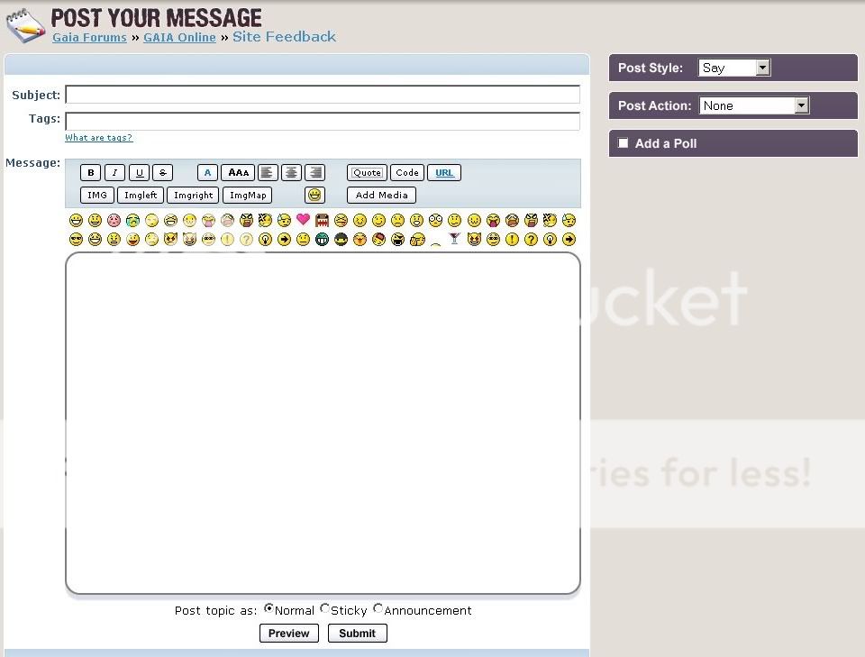
- miscellaneous forum bug fixes and changes. We've gotten a lot of feedback on the posting form, so we're redoing it (see the bottom of this journal entry for a sneak peek). It takes care of a number of things that people have mentioned, including the fact that emoticons were too hard to use.

UPDATE 9/18
- we rolled out the forum pulse and then saw the server load go way up, so we pulled it back out -- it's a neat feature, but we don't want to make the site slow for everyone! We fixed the problem this afternoon, and we'll be rolling it out tomorrow morning.
- we're looking at an intermittent problem with the avatars. More on this as we find out more.
- take a look at ijustworkhere to see a different mock of some of the other forum changes we're doing!

UPDATE 9/19
- rolled out forum pulse today (working around a MySQL bug in the process), and reactions seem to be pretty favorable.
- we rolled out a change that should greatly reduce the number of scams that are run on users. Basically, we won't let you put your password in a PM anymore. (And, once again, a reminder: anyone who asks you for your password is by definition not legit!)
- a legitimate question is, "Why add forum pulse when there are still bugs to be fixed?" It turns out that forum pulse was just a little bit of effort by a developer that was not doing anything else, so it didn't take anything away from bug fixing. Rest assured that we're hard at work fixing any glitches left over from the UPE rollout.
- with that said -- we keep hearing reports of people not being able to post messages. We thought that we had licked that problem on Monday, but it still seems like some people are hitting the problem -- so, please, if you are able to reproduce the problem consistently and have tried clearing your cache already, leave a comment below!

The new look for posting:
User Image


User Comments: [20] [add]
Emelend
Community Member
avatar
commentCommented on: Tue Sep 18, 2007 @ 07:42am
Woo, that new posting form looks great. I noticed it kind of integrates the new background color. Does this mean we'll be seeing the new color throughout the forum soon? surprised

Oh and yay for weekly development messages. I love knowing what's going on at Gaia HQ. whee


commentCommented on: Tue Sep 18, 2007 @ 10:55am
I love it. Especially that purplish color. ninja

I am so happy that the emoticons are now RIGHT there and not a click away though I have to admit in the past week while it was hidden I started to quickly memorize some of the codes for my more commonly used emotes.

But yes I love it, the emotes are all evenly distributed and doesnt have a gap after the last one. :]


ZakuMent
Community Member
[DarkDreams]
Community Member
avatar
commentCommented on: Tue Sep 18, 2007 @ 03:16pm
that looks much better, however i do have one request, is it possible for users to set their own default posting options, for example, i like to post in the "think" style and i was wondering if there was a way to set that as my default style in my account preferences etc.

its looking a lot better though, thanks for the information.


commentCommented on: Tue Sep 18, 2007 @ 05:11pm
@Emelend: Yah, we're going to be tweaking background colors all over the place to make it more consistent.

@DarkDreams: Oh, that's an interesting idea, I'll ask the forums team about that. It's generally a pain to add options, but it might be possible to default to the last one you picked.


Panagrammic
Community Member
Hearts Pebbles
Community Member
avatar
commentCommented on: Tue Sep 18, 2007 @ 05:37pm
That new posting box is smexy. SO much nicer than the other one. (I kept trying to click on it while posting my message before remembering that it hasn't been implemented yet)

At any rate, I think a weekly development update message is certainly a good start. Lots of users follow vocal devs, stalking their posts, and checking in on journals multiple times a week. The problem is though, with Gaia expanding at the rate it is, we don't always know that there's somebody new on the block who might have a mind blowing journal that we can read. (Hell, I didn't even know about you until you posted in my thread) Would all the devs have a chance to say something at some point in time, or is it going to be an NPC, like say, [GAIA] Development? If it's an NPC, would they be able to have links to all the Dev's journals or something? Just a thought.


commentCommented on: Tue Sep 18, 2007 @ 07:23pm
I do like the new posting a lot more. It still looks blog-ish, but that's something that I'm bound to get used to. It will sure be weird to have the poll option up on the right-hand side, instead of the bottom! blaugh domokun


jfnbhgurkddhj8
Community Member
Infamous
Community Member
avatar
commentCommented on: Tue Sep 18, 2007 @ 08:12pm
Aw. I liked the little small posting box. I could put it in my pocket. D: Although, I could see it not being that great when wanting to do a wall of text.

Oh, the not letting one post bug.. how I hate you so. x.x At least I was only bothered by it when the new forums changes were added.

I like how it isn't going to continue with the blinding white look.


commentCommented on: Tue Sep 18, 2007 @ 08:39pm
biggrin thank you for listening. this new feature looks awsome. heart
i also like very much that we have color instead of blah white.


twnby4
Community Member
Emelend
Community Member
avatar
commentCommented on: Tue Sep 18, 2007 @ 08:45pm
I just noticed that some of the emoticons above the posting box are repeated, whereas some aren't there at all. Was that intentional? eek


commentCommented on: Tue Sep 18, 2007 @ 08:49pm
That looks great! My main qualm with the forum change was that it clashes with the header.

I hope the front of a forum matches eventually, too. I guess it's the ATer in me.

I missed the Forum Pulse glitch, and I don't think I quite understand the point of it, but I guess I'll see when it gets here.


Skepticowl
Community Member
123jimmy321
Community Member
avatar
commentCommented on: Tue Sep 18, 2007 @ 09:26pm
wow i cant wait to use it lol


commentCommented on: Wed Sep 19, 2007 @ 02:14am
@Emelend: Yah, the designer just copied/pasted so that we would get a sense of what it looks like -- the real icons will be there in the actual implementation.


Panagrammic
Community Member
[DarkDreams]
Community Member
avatar
commentCommented on: Wed Sep 19, 2007 @ 02:28am
woohoo, thanks for that!

if it gets implemented remind me to e-hug you xd


commentCommented on: Wed Sep 19, 2007 @ 05:11am
*loves* This is like, ten billion times better. I'm so, so happy that these changes are going ahead, and can't wait to see them!

Just a quick question: was the redesign always planned to eventually look something like this and what we have currently is just an interim solution, or were you actually planning on keeping it like this until mass complaints came about? sweatdrop


Chisa
Community Member
Digital Puppetry
Community Member
avatar
commentCommented on: Wed Sep 19, 2007 @ 05:53am
I have to say I like this one a lot better then the one we have now.

But please, when I start up the post... could you have it so that the emotes are hidden at first.

I liked it when they were out of view. Because I have to say, I don't really use them much.


Keep up the good great work!

-Edit- I just noticed the bottom. I hope we don't get the option to post an Announcement or Sticky. You know for a fact it's going to be abused. Then again, that could just be the post option for Admin, Devs, and Mods... Yea, that's what I think it's for ^.^"


x.Reina R.


commentCommented on: Wed Sep 19, 2007 @ 07:09am
OK, some feedback:

The box is way too tall. I love that it's wider, but the height just seems a bit overboard.

I do hope that you are going to have the spiffy emote pull down/up thinger. I really liked that. D: Even if by default, it's pulled down (maybe it can remember our preference for this?)

I also think the background looks funny. It looks almost like the post section is framed-- in all honesty, it's ugly. I suggest throwing the side options into the same "box" section as the post options. I also suggest changing the blue bars to the purple color.

Another option to consider would be to change the white box section (not the post box) to brown as well.


SykoSilver
Community Member
setsunaeternal
Community Member
avatar
commentCommented on: Wed Sep 19, 2007 @ 05:20pm
Ah, so that's what it's going to look like when it's all said and done? In that case, I love it X3! Right now it just seems to be floating in empty space and it kinds irked me that I had to click on the emote-button to actually see all the emoticons. Cool beans biggrin


commentCommented on: Wed Sep 19, 2007 @ 07:52pm
Chisa: what you see implemented right now was absolutely just an interim design solution. sweatdrop A lot of the design elements you currently see on the forums were intended for the last design, and even then, they needed a lot of work. We're working on something that should work for this current design interation, though. Check out ijustworkhere's journal for another screenshot if you haven't already.


Ling
Community Member
Chisa
Community Member
avatar
commentCommented on: Thu Sep 20, 2007 @ 02:54am
Thanks Ling, good to know ^_^ Personally I think it would have made more sense and saved a bit of pain on the user's side to wait until this design was complete rather than having an interim one, but I'm not in the know so I guess you have your reasons sweatdrop


commentCommented on: Thu Sep 20, 2007 @ 03:11pm
Hmm, I must say that it's certainly an improvement, and I do appreciate the time and effort going into the changes. The only two issues/concerns I have at this point are merely cosmetic and/or personal preference. User Image

First, in agreement with something SykoSilver said... the post box seems too large. Not entirely, of course, it's just that it feels somewhat excessive, for some reason. User Image Maybe 80-85% of that size would be feel better.

The other point... while I do like the way that things are formulating up into various buttons, as far as text color and size, I'm one to prefer the original dropdown menus. Having a little palette menu pop up on clicking the button is neat and all... but the dropdown menu was so much more efficient.

Again, I suppose it's more personal preference than anything, but ah well. A voice unspoken is the voice unheard.
User Image


Xanilus
Community Member
User Comments: [20] [add]
 
 
Manage Your Items
Other Stuff
Get GCash
Offers
Get Items
More Items
Where Everyone Hangs Out
Other Community Areas
Virtual Spaces
Fun Stuff
Gaia's Games
Mini-Games
Play with GCash
Play with Platinum